Our Brand
EQ is built on an enduring commitment to quality and consistency, with an approachable timeless style.
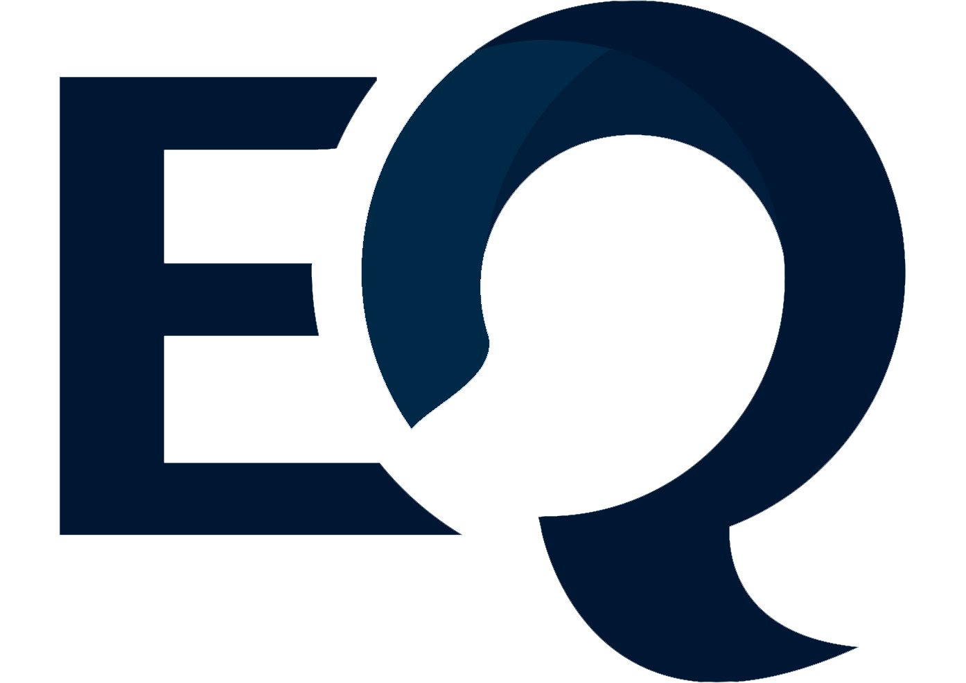
Our Logo
The logo symbol is a powerful, yet approachable image that evokes the conversations we have with our clients.
The letter “Q” in the middle of the text acts as both a question mark and a speech bubble—clients have questions and EQ has the answers. The gentle gold at the arch of the “Q”, perfectly juxtaposed against the sturdy blue, conveys our ability to listen, while the white space at the centre acts as a hub for solutions and possibilities—it’s where meaningful dialogue happens, with a view to designing and securing people’s futures in a progressive way that blends technology with human warmth.
Our Colours
EQ’s corporate colour palette is based around a strong shade of blue, paired with a muted gold that anchors the imagery in two hues. The combination communicates the approachability of a Caribbean-based firm, along with the reassurance of world-class professionalism.
The colours we have selected to represent our brand tell our clients that we are reliable and ethical, innovative and service oriented, experienced and well established—a sustainable company that will be there for the long haul. Further, the shades of the colours we have chosen to convey our corporate identity all convey the warmth, trust and stability we provide to our clients.